
Urban Swan
Redesigning the search experience

Project Overview
Urban Swan is an experience marketplace targeted to Gen Z and Millennials. This case study explores the redesign of the search and categories functionality for the Urban Swan website, aiming to improve user experience and conversion rates for activity bookings.
The Problem
Users were struggling to efficiently find experiences that matched their interests, leading to a high bounce rates on the search results page and low conversion from search to booking.
The Solution
A search bar that enables customers to quickly discover and book experiences that match their interests and preferences and allows customers to find specific activities without browsing through multiple category pages.
Our redesigned search experience will deliver the following key benefits, driving growth and user satisfaction:
Quick experience discovery - It offers customers a direct path to find activities that interest them. This eliminates the frustration of clicking through multiple category pages to find the right experience.
Enhanced customer experience - When customers visit UrbanSwan, they often have a specific type of experience in mind. Data shows that 43% of visitors immediately use the search bar upon arrival. An effective search function helps them quickly find experiences that match their interests, schedule, and location preferences.
Higher booking rates - When customers can easily find experiences that match their criteria, they're more likely to complete a booking. A robust search function encourages deeper engagement with the platform, as users can quickly narrow down options based on their specific interests, availability, and budget, leading to increased bookings.
Research Process
User Research
Methodology:
Conducted 12 user interviews
Performed 8 usability tests of existing system
Created heat maps of user interactions
Key Findings:
Users often combined multiple search criteria (e.g., "outdoor cooking class weekend")
Users wanted to filter by both activity type and practical constraints (time, location, price)
Category labels were confusing and overlapping
Competitive Analysis

Examined search and category systems of:

Identified successful patterns:
Progressive disclosure of categories
Robust autocomplete suggestions
Clear visual hierarchy in results
Smart filters based on search context
Design Solution
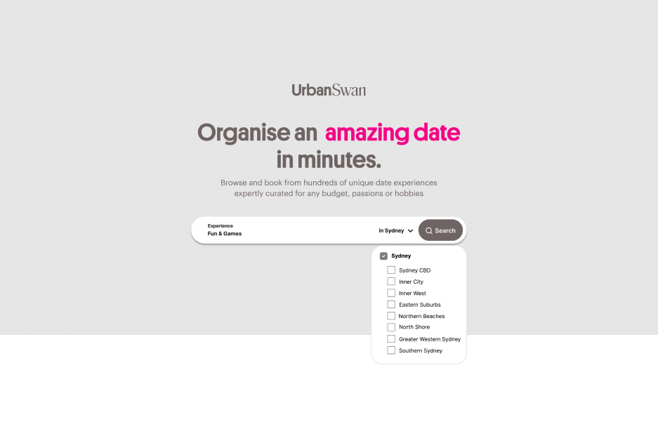
Search Improvement:
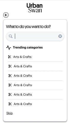
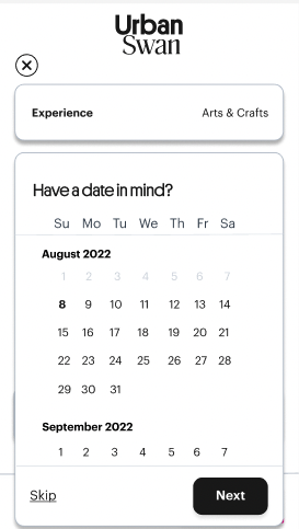
A prominent, full-width search bar that opens into an interactive modal
Three primary search parameters (what, where & when)
Calendar integration that allows for flexible date ranges or specific dates
Added "trending experiences" suggestions
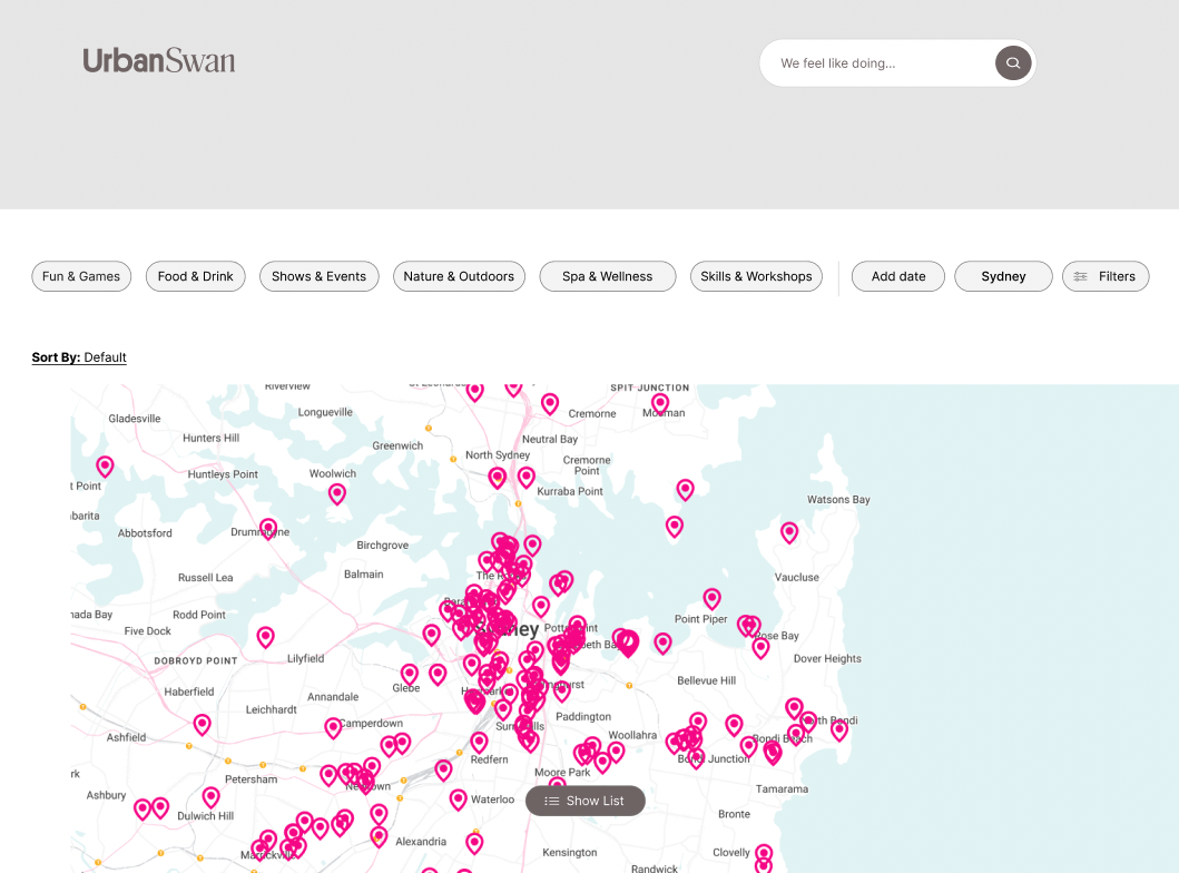
Advanced Filtering:
Category tabs at the top showcasing property types with visual icons (Pottery, Bars, Massage, etc.)
Dynamic filters that appear based on search context
Added "Similar experiences" suggestions
Prototyping & Testing
Initial Prototypes
Created low-fidelity wireframes testing:
Category organisation
Search flow
Results display
Filter interaction
Usability Testing
Conducted 2 rounds of testing:
Low-fidelity prototype with 5 users
High-fidelity prototype with 10 users
Iterations
Made several key improvements based on testing:
Modified category icons
Simplified the category search section
Added ‘Trending Categories’ in search bar
Improved filter visibility


End Design
Through close collaboration with our engineering team, we implemented the redesign in strategic phases. Here are the final design outcomes
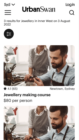
Search Bar:
A redesigned search bar with powerful filtering options that help you find exactly what you want. Simply type in what kind of experience you're interested in then use filters like available dates and location to get results that match what you're looking for. The idea is to connect you with the perfect experience without having to dig through pages of options that don't fit your needs.
Categories
We've thoughtfully placed additional filtering options right below the search bar to help you explore even further. Our refined search system helps connect you with experiences that spark your interest – without the endless scrolling.


Lessons Learned
What Worked Well
User-centered design process
Iterative testing approach
Close collaboration with engineering
Areas for Improvement
Earlier involvement of stakeholders
More extensive A/B testing
Next Steps
Add machine learning for better suggestions
Expand on category system
Conclusion
The redesign successfully improved the user experience of finding and booking experiences. Key to this success was the combination of user research, iterative design, and close collaboration with stakeholders. The project demonstrates the importance of balancing user needs with business goals while maintaining a focus on simplicity and usability.
Appendix
Tools Used
Figma for design and prototyping
UserTesting for remote studies
Hotjar for heat mapping